Product Card Hierarchy
Piecemeal design leads to messy information hierarchy.
Working Team
Oshin Nayak, UXD
Ray Alexander, Manager UX
Shop Group Product Manager
Raouf Solaiman, Director of Product
Developers
Martin Davis, Front-end
Joesph Kratz, Back-end
Data + Analytics
Bob Seifert, Analytics
Timeline
2020, Summer — Design & research
2020, Winter — Initial test
2021, Spring — Iteration of test
2021, Summer — Color swatches
Over the years, functionality had been added to the collection page without a holistic vision.
The Problem
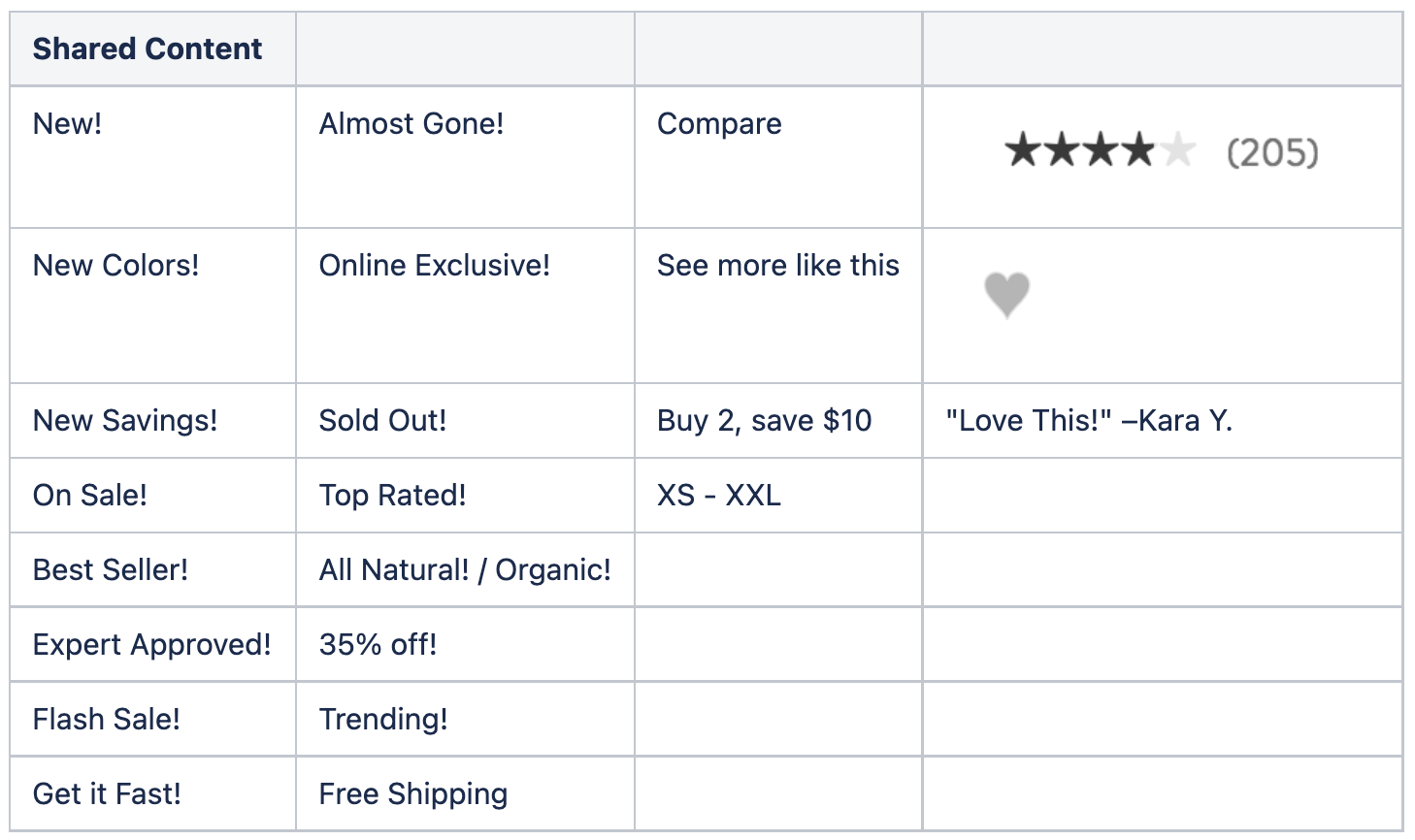
There were 12 separate pieces of information potentially displayed on any given product within a collection, with no real hierarchy.
The Solution
Understand the user’s perspective about important collection information and update the display to reflect those needs.
The Existing State

So, where do we start?
Because we were trying to create a comprehensive understanding of what information should be displayed on collection pages, what order it should be displayed in, and how prominently it should be displayed, the natural place to begin was by understanding how customers scanned collection pages, and what information they were looking for.
Our initial assumption.
On collection pages, the primary questions that users are trying to answer are “what makes this product different from the ones around it? Why is this the right product for me?”
Enter…the Card Sort
Card sorting allowed us to really interrogate what pieces of information that people found valuable and why, without biasing them towards information we were already showing.
We set up the card sort to include any piece of information we thought could reasonably belong on a collection page.

The card sort gave us lots of good data to chew through about what people wanted…and why.


After analyzing the data, we came up with a list of key insights.
Because this project was dependent on buy-in from our merchandising and marketing partners, we created some videos that compiled participant feedback with our key findings. There are few things more powerful than hearing real customers speak to a room of cross-functional partners…
Images
Images are important above everything else.
Different people want different images.
Images are the first source of product information.
Colors
Seeing the color range up front is important.
“New Colors” means more for known products.
Badges
Badges are used to figure out if a product is “good”
Badges only work if the customer has trust.
Badges mean more when they speak to a product’s unique qualities.
Reviews reinforce product quality.
Then Design Exploration.
A lot of exploration. We looked at order, visual styling, and information hierarchy in hundreds of different ways, trying to find that sweet spot between meeting customer expectations and elevating the brand projection.


…do we need all of this information on collections?
We found ourselves asking this question quite a few times during our explorations. While the card sort research validated the importance of a few pieces of information, it certainly didn’t provide us with clarity around everything that currently existed. Initially, we wanted to run a series of A/B tests where we removed each item independently to measure its impact. We did run a few, and they ended up being flat. So while UX advocated for removing the items that weren’t providing explicit value, our merchandising partners wanted to retain them for their purposes. The compromise we landed on was making all of these pieces of information configurable within the CMS — they could be set to display or not display for specific collections, allowing us to present a more simplified view to the customers in many scenarios.
Our MVP
For the first test, we went out of the gate strong by introducing a really extreme version of hierarchy.
We obviously pushed a bit too far. The test trended slightly down and we rolled back to control and went back to re-assess.

Iteration
We softened the hierarchy a bit and came back for Round 2.
0.8% increase in conversion
0.6% increase in revenue per visit

But what about colors?
Our user research identified that seeing the color range was one of the most important pieces of data. Although we weren’t able to build that solution initially, we did come back and build it later in the year.
1.2% increase in conversion
1.6% increase in revenue per visit

What did I learn?
Starting with data is critical. A broad design exploration is critical. But at the end of the day, success is best measured through testing.